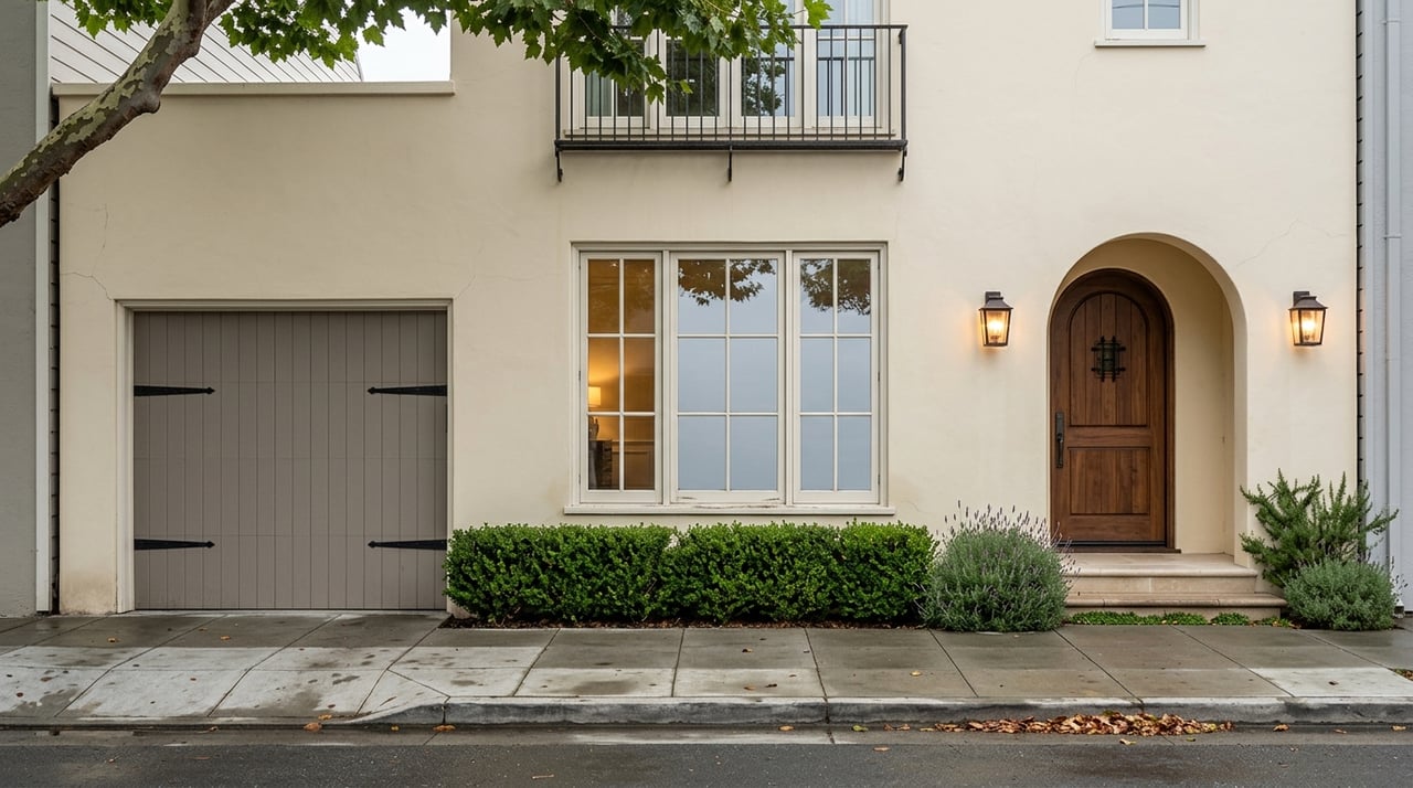
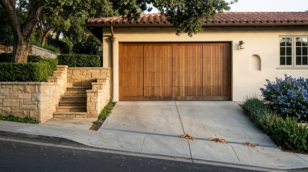
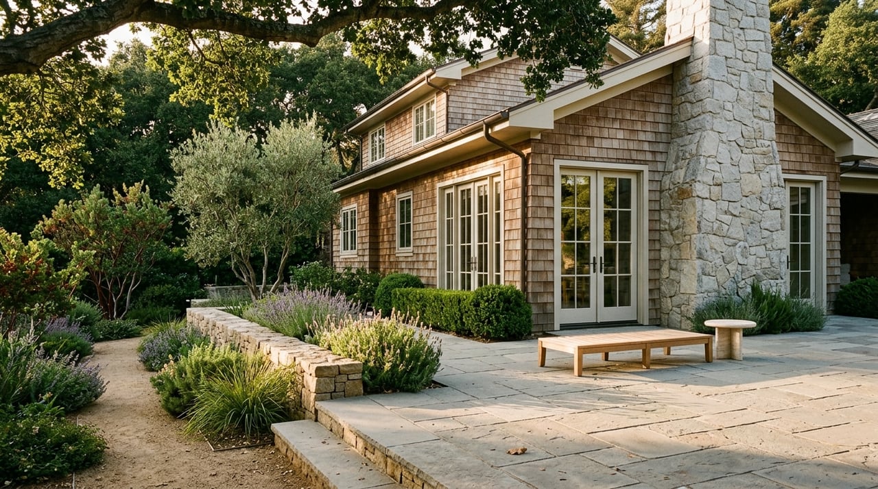
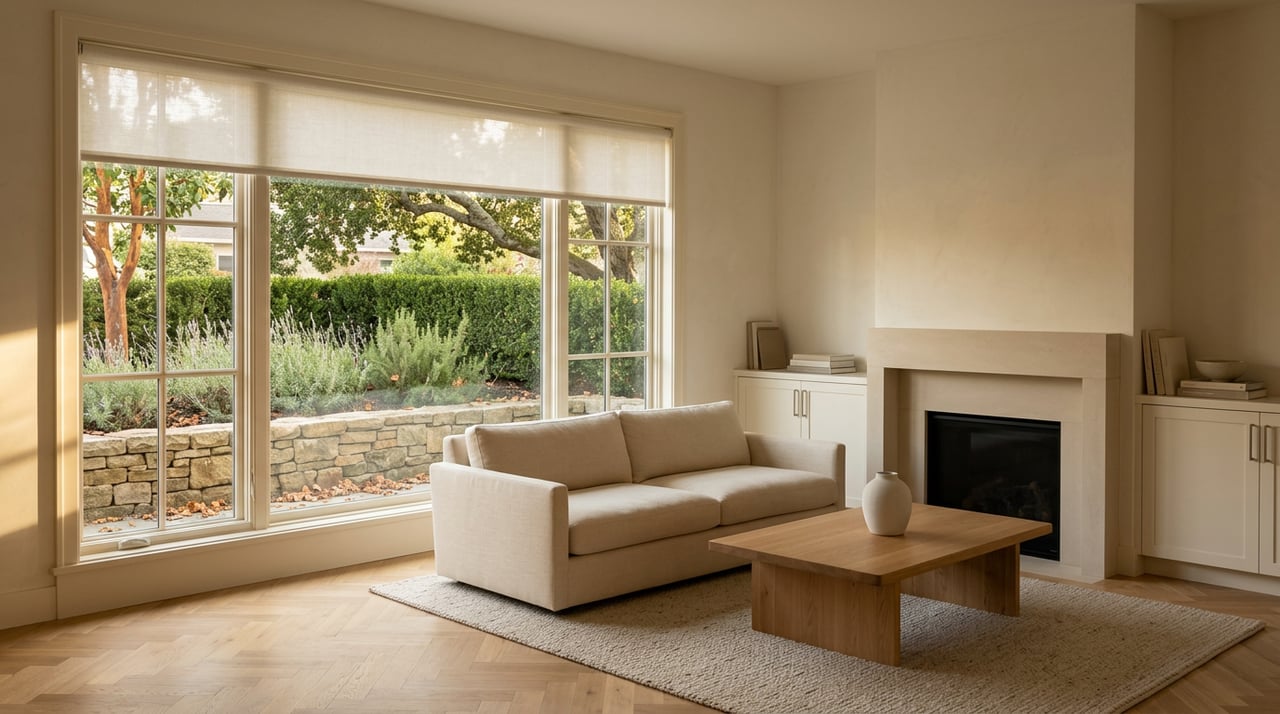
The fires in southern California aren’t yet contained so I went back and forth about whether to “move on” in content here. I’m going to, because that’s the nature of the world, and at the very least maybe a bit of fluff will be a welcome respite from all the chaos at large. If you feel so inclined please consider contributing to recovery efforts—no doubt your spheres have shared links, but there’s always the California Fire Foundation or the American Red Cross.
Mocha Mousse 17-1230
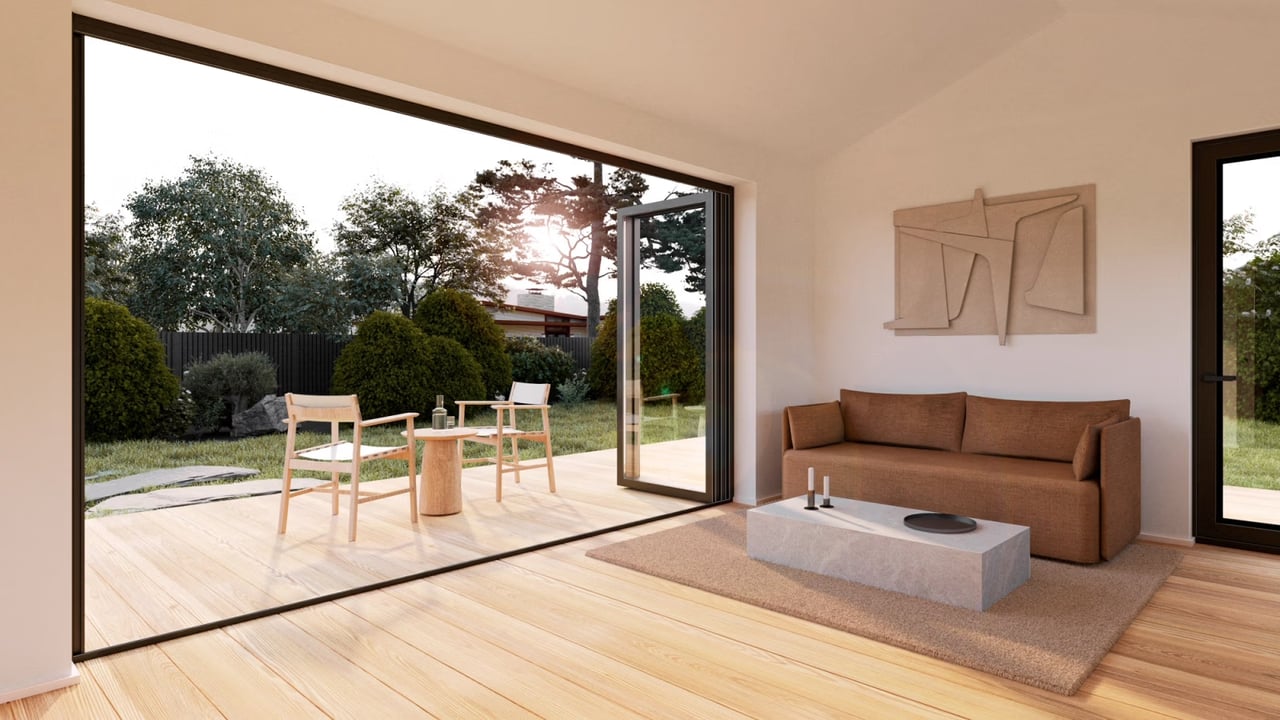
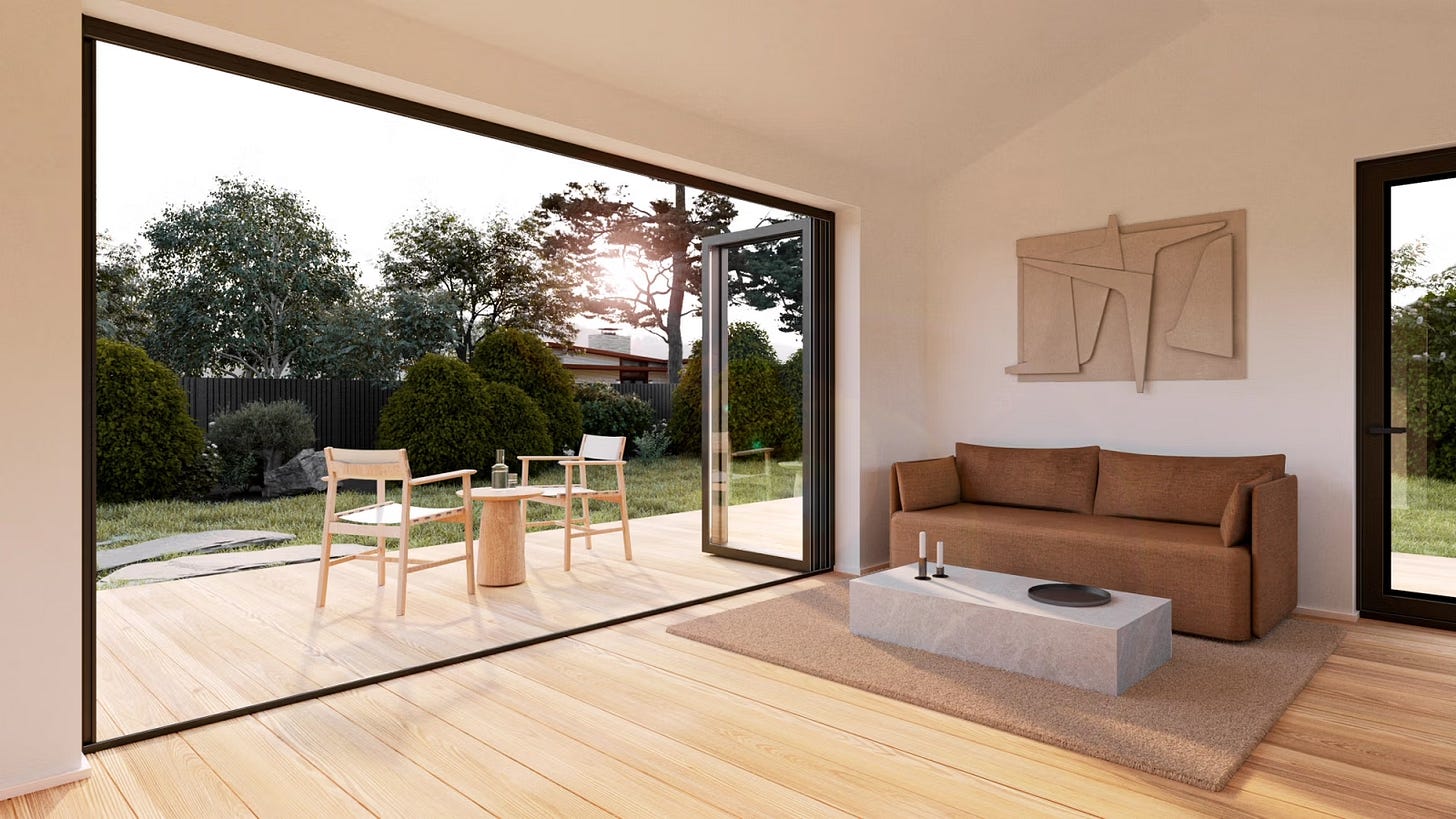
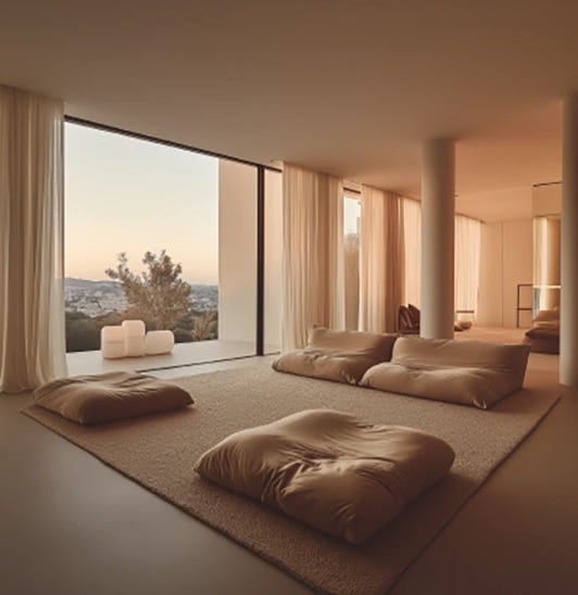
Not technically a biblical passage but maybe for some people, Mocha Mousse 17-1230 is the sort of unassuming light chocolate shade that Pantone recently unveiled as their 2025 Color of the Year—a moment I genuinely look forward to every year, and which was this year a moment instead that left me feeling disappointed and perplexed when I pulled it up on Instagram over the holidays.
This was the long-awaited follow-up to 2024’s electric and suggestive Peach Fuzz?
A let-down, a lazy outrage! We’re chugging along in this nightmarish global landscape trying to “make the most of it,” and insisting on hope and optimism, and our guiding hue from on high is to be a muddy suggestion of mood?
And yet the more I’ve sat with it, the kinder I find myself feeling towards it, the more possibility I see in the soft warmth of cocoa, how there can be a richness in the natural, how it offers up a base for delicate sweetness and might even bring the existential temperature down.
I, who’ve historically railed equally against garish sprays of color and soul-sucking sterility, find myself realizing: isn’t this compromise what I’ve been looking for on some level? A bit of grounded patience, a return to the earth, a thoughtful stability.
Even the ease with which I’m waxing poetic about this right now betrays my fondness for a color I hated not one month ago. Guess they do know what they’re doing, those Pantone people!
White Houses (Not by Vanessa Carlton, but Also)
I’ve wanted to write about color and paint in homes for a long time.
One of the things that comes up frequently and immediately in real estate is just how very white houses on market look. There’s a pronounced and pervasive stereotype—which has been elevated for better and worse to something of an ideal—of a model home in which the walls are white, the kitchens are sparse and open, and the marketing photos online are overexposed to heighten that sense of erasure. I’m quite sure you know what I’m talking about, and that you have feelings one way or another.
Me? I hate it! [“Me? I loved him!”]
And, I also understand why we realtors (often, usually) present homes the way we do.
Before I got into this business, I knew absolutely nothing about real estate, The Industry. I had a highly developed sense of aesthetic and what might be considered an unhealthy snobbishness about architectural and design integrity. Houses on Redfin were by and large, in my clearly not humble opinion, a travesty. Where was the color? Where were the bookshelves crammed with the library of a lifetime? The well-traveled rugs and untamed gardens and sense of self? I thought: my god this is all so pedestrian.
Even once I got into this business I was so sure I would do it all differently. My listings would be instantly discernable as “an Analise;” impeccable taste abounding, my listings would be featured in Dwell, not just on Zillow.
Fast forward seven years and I find myself in Farrow & Ball on Fourth Street in Berkeley, earnestly asking the very hip consultant with carefully unwashed hair:
“So which whites are people into lately?”
Lack of Imagination vs. Inviting Imagination
For what it’s worth, some of my transactions have been worthy of media interest: I put an incredibly cool buyer into an incredibly cool top-floor condo in San Francisco’s Mission District that was considered for a profile in the NYT and will be featured in a forthcoming film thanks to its architect owner having custom-built quite a lot of interesting features. I had the pleasure a year before that of co-listing the Russian Hill flat of a storied artist adamant about not being named publicly in our marketing, and whose taste was then and remains still sophisticated and curated and colorful. [Fun challenge for you if you get bored reading my work: count how many run-ons I can cram into any given piece; you’ll never stop me.]
Those cases are exceptions.
Not for want of intriguing people on the hunt, many of whom are clever and cultured, our market doesn’t support much in the way of deviation from a visual baseline.
The short version: A listing agent’s job is to maximize the exposure and interest in sellers’ homes in order to drive competition (see: multiple offers) and yield the highest possible price as a result. Taste is subjective, and color and quirks can be divisive, so we neutralize aesthetic in favor of mass appeal. One of the most effective and efficient ways to do that, is to paint the interior white.
There are always five million caveats to what I write, and three big ones here are:
-
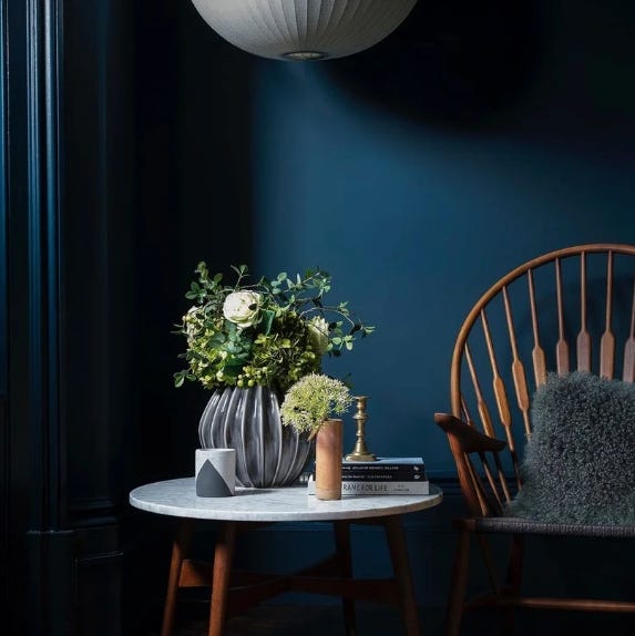
I do think it’s fun and worthwhile in a listing to throw in colorful paint accents, whether that’s a neutral but off-white trim, a bold wall color in a dining room (see: personal fav Farrow & Ball Hague Blue in the photo below, god help me), or even a fun wallpaper in an under-stair powder room if the budget and house style permit.
-
White paint in and of itself isn’t a stylistic death sentence—some of my favorite Scandinavian and Japanese minimalism counts on it—it just often goes hand in hand with a lack of intentionality or creativity, which are the cases in which I take umbrage.
-
There are absolutely ways to preserve personality in a home even while upping the neutrality, and we do always try to do that!
In future issues I’ll get into the trends of extending color to the ceiling, the potential vibrancy of a backsplash tile, and the very different considerations when it comes to exterior paint. For today, we’re starting with the basics.
Paint it, White (“No Colors Anymore”)
Why painting an interior white is the go-to approach for market prep:
-
It’s time- and cost-effective. Something major to keep in mind, which I simply didn’t think about before I was personally working with sellers, is that the budget for prepping a house for market, to sell it, is not the same as an owner’s budget for subsequent labors of love. Here in the Bay we’re often looking at $30-50K in prep and staging costs for a <$1M home (there—saved you the sticker shock, now you can hire me already mentally prepared). The return on investment on proper prep is all but assured, and/but that’s because a listing agent’s job is also to be strategic in which work is undertaken.
If budget’s a concern for a seller, painting an interior white is cheaper and less involved than installing overhead lighting or tearing down a wall, and it achieves the same goal of brightening and opening up a space. A paint crew can also take care of even a large interior within two weeks, and even sometimes while other prep is going on simultaneously; it’s no one’s ideal but I’ve had a floor team essentially follow painters room by room to refinish hardwood to satisfy a time crunch. When a seller is racing the clock to take advantage of seasonality, a straightforward paint job is a no-brainer.
-
“New paint smell” is compelling. I cannot wait to write a whole issue on the highlights of buyer psychology, but for now I’ll just say that buyers do not generally respond well to being in “someone else’s home.” Even if they don’t realize it consciously! Walking into a house for sale and smelling that fresh chemical signifier of readiness for a new steward is *chef’s kiss emoji.* Plus, it’s a quick way to eradicate or at least lessen past pet smells, antique stuffiness, or a smoking habit (but please, owners, your future selling self will thank you for not smoking inside your home).
-
Lack of imagination is a thing. Not everyone has the capacity to envision a new space for themselves. And that’s not a bad thing! (Consider me a recovering snob). “Reducing” a home to a glorified box can make it easier for buyers to focus on the bones, as we say (well I don’t say that, but we the industry do). Being able to compare apple homes to apple homes simplifies the house hunt and gives structure, layout, and location a chance to occupy the foreground of considerations.
-
Inviting imagination is also a thing. A clean canvas is a beautiful concept. Think of the possibilities! And buyers do—even if they step into a house (like I might) and say “This is awful, why would they make this so white? This would look way better if it were like, a deep blue, like that color Nate has,” that’s great! They’re already envisioning making the space their own, and care to criticize suggests a readiness to emotionally attach. A neutral backdrop is an invitation to consider how you would live in a house, how a house would become your home.
-
White paint allows staging to shine. Staging might not be a given in your neck of the woods, but in the parts of the Bay I work it’s a must (assuming you’re looking to maximize profit). The ins and outs of staging are yet another forthcoming topic on this blog, but for now suffice it to say that the right staging yields a huge impact and elevates a home to that “model” style that feels aspirational instead of heavily lived-in, while still showcasing practical possibility and exemplifying a sense of spatial capacity (“Oh look—we can fit the king bed in here”).
Creating an open playground for stagers to come in without restrictions from competing colors or design choices maximizes options and makes for more fun. [Of course, listing agents typically (should) work with their stagers to choose color and tile and floors etc so that there’s a cohesive vision from the start, and money isn’t “wasted.”]
-
There are different kinds of white paint. This is the annoying and subtle and grand finale of points, and you’re either a person who already loves the gamut of options and are nodding your head vigorously, or you’re going to think I’m a loon—and I’ll just say that two things can be true. I liken the quiet and often unconscious effect of a white paint variation, to human eyebrows. You might not consider someone’s eyebrows consciously (Eugene Levy’s, sure), but change those little caterpillars even a little bit, and you’ll be surprised at how drastically that person’s entire face and presentation follows suit. I was a willing victim of the 2000s thin brow phase so this is particularly personal, but if you weren’t, congratulations and just go ahead and google celebrity before and after brows sometime and you’ll get a sense.
SO ANYWAY, white interiors are the eyebrows of the home, as they never say.
“Warm Neutrals Are In”
To get us back on track and bring this whole thing—pun decidedly intended—home: there I am standing in Farrow & Ball (which by the way if you don’t know or care about paint, is a high-quality, high-cost British purveyor of paints that’s low-key pedestaled in the zeitgeist as Thee Nice House Paint).
I’m standing in Farrow & Ball asking about which whites are in, because I’m now a person who gets paid to tell sellers that they should essentially neuter their home in service of getting more money. I’m thinking I might like the Pantone Color of the Year because I’m tired and in need of a visual salve. I’m already crafting an argument in my head to convince my former self that embracing a simple standard isn’t selling out, it’s strategic! And you know what: I believe it.
And so the guy at Farrow & Ball says: “Warm neutrals are in.” And I nod sagely and say, “Because we’re all traumatized by the world and can’t take anything else cold.” And instead of murdering me for my only-half-kidding facetiousness in this hallowed hall of style, the guy agrees and points me to the selection of red-based and gray-green-toned whites (“complex” in nature!), that offer a “cozy-feeling space” and “feel as if they’ve been there forever.”
I take a samples brochure and raise my hand in gracious farewell, letting the door fall softly shut behind me while I gear up to tell everyone on the internet why white walls aren’t so bad after all.
Afterthoughts:
-
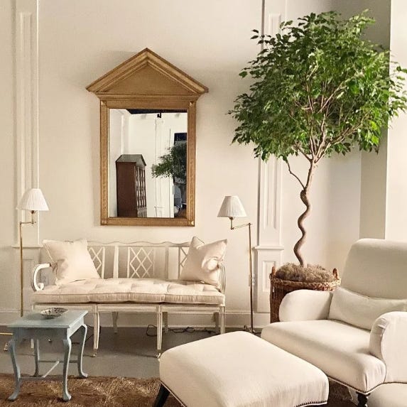
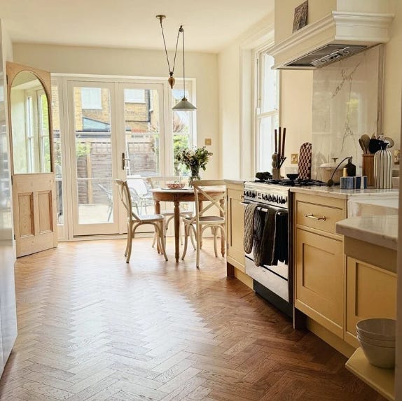
Farrow & Ball is a great source of inspiration for listing prep, but when we’re painting homes for sale we go with the more practical Benjamin Moore or equivalent. That said, one of the popular F&B neutrals currently on trend per Hip Employee is “Pointing” which I quite like. (The photo below features Pointing on the walls and Hay on the cabinets).
-
Some of my favorite go-to BM whites for listing interiors—and this is not remotely creative, if you poll my agent or stager peers there’s a 93% chance they’ll name at least one of these:
-
Benjamin Moore Simply White
-
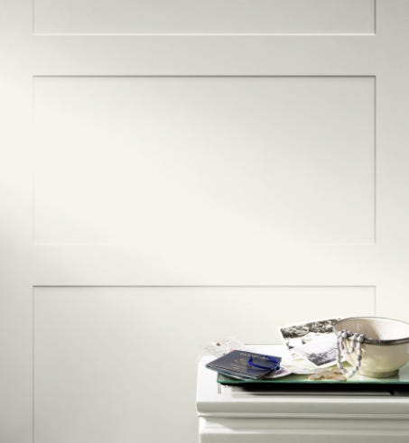
Benjamin Moore White Dove (see below! A color not to be confused with Sherwin Williams Dover White or BM Dove Wing—I’m always reminded of SNL’s Dylan McDermott vs Dermot Mulroney)
-
Benjamin Moore Decorator’s White
-
Benjamin Moore Chantilly Lace
-
-
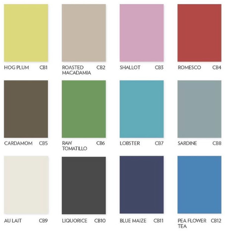
Back to Farrow & Ball: they have a new collection out that’s truly so much fun! It’s a collaboration with fashion designer Christopher John Rogers, colorful, inspired by childhood, and intended to embody “exuberance.” And wouldn’t you know, in a funny and fitting nod to this entire issue, it’s called: Carte Blanche.
-
This last note is so far beyond the scope of this issue but I’m going to mention it anyway because I attached some big ol’ price tags above: financing list prep as a seller can be a burden. It’s all good and well that you’ll get return on investment, but how do you afford the investment? If you have the money, I’ll tell you to spend it. If you don’t have the cash on hand, we can talk about ways to “find” it, whether that be arranging with my tradespeople to get paid out of escrow at close, or me fronting you the deposit to be reimbursed at close. Most recently, my brokerage is coming out with a “credit card” that functions something like a HELOC that allows sellers to fund pre-market prep but with interest only accruing beginning upon actual use of funds. The point: I’m going to tell you to undertake prep to the tune of tens of thousands of dollars, and I’m going to help you make that happen.
